
Timeline
-
September - December (12 weeks)
My Role
-
Solo UX Designer
Problem
Current dating apps are missing a feature that allows users to connect based on shared interests in memes and sense of humor.
I wanted to make this app because I believe that having a good sense of humour is an important quality in a partner and that shared interests in memes can be a great indicator of compatibility.
The solution
Matches based on humour
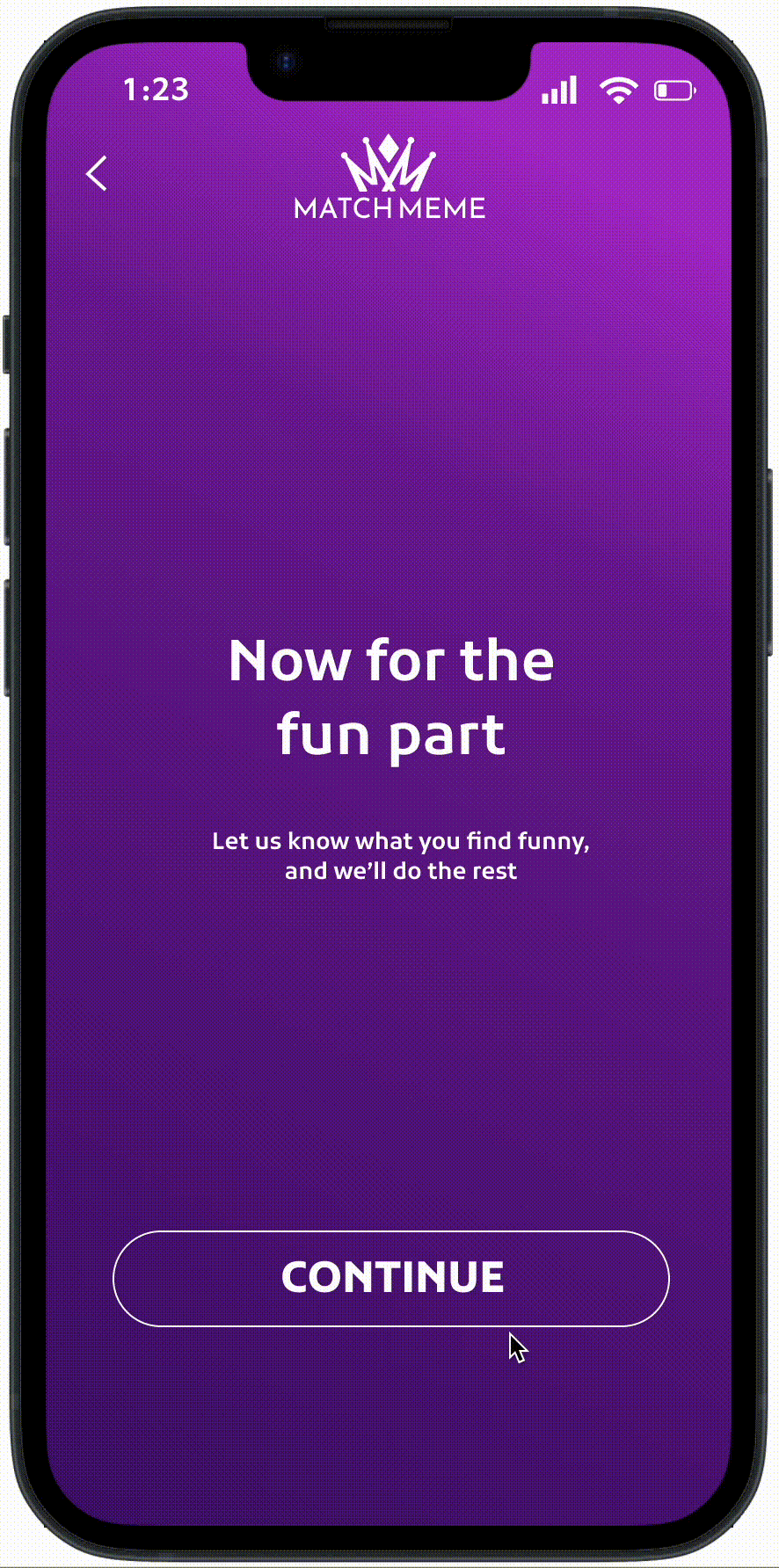
Browse through different memes and find others with a compatible sense of humour
-
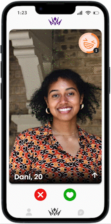
Swiping on memes is a crucial part of the MatchMeme experience, as it allows users to connect with each other based on their shared appreciation for memes and sense of humour.
-
By swiping on the memes that they find funny, users can quickly and easily find matches who have similar tastes in humour.
-
This helps to create a strong foundation for relationships formed on the app, as shared interests and a compatible sense of humour are essential for a fulfilling and lasting connection
Swipe through different people and see how compatible you are
-
MatchMeme is all about connecting users based on their shared interests and compatible senses of humour.
-
One way we do this is by allowing users to swipe on profiles and memes that align with their own sense of humour. This helps users quickly and easily find matches who share their sense of humour and allows them to build strong foundations for relationships formed on the app.
-
In addition, our app includes an indicator that shows how compatible users' senses of humour are, providing a helpful reference for users as they determine which profiles to swipe on.
Process
What did I work on?
In my first sprint, I focused on designing an experience that matched users based on their shared appreciation for memes and sense of humour. In the second sprint, I shifted my focus to making MatchMeme more viable by considering the product strategy, go-to-market strategy, and potential edge cases. By fine-tuning the matching algorithm and exploring different options, I was able to create a strong foundation for the app and set it up for success. I finalized the project with micro interactions and added the laugh meter to further tune in the compatibility levels of others.
Initial Market Research
"Greater appreciation of one’s partner’s jokes was related to a higher perception of match in a relationship"
According to the research made by Spanier (1979) "Measuring dyadic adjustment: New scales for assessing the quality of marriage and similar dyads" he concluded that having a greater appreciation for your partner's jokes is related to a higher perception of compatibility in a relationship. All of the research reinforced that there was massive potential in this industry and helped me narrow down my goal to make a dating app not solely based on looks but heavily based on humour.
Competitive Analysis
Competitors often lack a sense of authenticity and genuine connections, making it difficult for users to find compatible partners.
MatchMeme differentiates itself from competitors like Tinder and Bumble by focusing on users' shared appreciation for memes and sense of humor as a key factor in compatibility. While other dating apps may prioritize superficial characteristics or shallow swiping, MatchMeme encourages users to connect with each other on a deeper level by finding the humor in life's ups and downs. This approach leads to a higher perception of match in relationships formed through the app, resulting in a more fulfilling and lasting connection.


User Research
My interviewees were much most comfortable using a dating app that was based around laughter instead of looks
I conducted interviews with 8 students who struggled to find relationships on other apps. I found that my interviewees were 3x more likely to succeed when there was accountability for their sense of humour. Through my research, I learned that what people find funny is an important factor in achieving successful relationships, and I asked my interviewees about their experiences in order to identify trends and insights that could be useful for MatchMeme users. By organizing my data through affinity mapping, I was able to gain a deeper understanding of the challenges and motivations of my interviewees and how these factors relate to goal achievement.
My research question:
-
How have you used the MatchMeme app to find and connect with potential matches?
-
What do you look for in a match on the app?
-
How has using MatchMeme helped you in your search for a long-term relationship?
-
Have you had any memorable or unique experiences using the app?
-
Would you recommend MatchMeme to others looking for a relationship and why?
Main Insights
None of the previous dating apps that my interviewees used were successful due to the absence of realness and shallow swipping.
From the trends in my affinity map, the lack of authenticity in other dating apps highlights the usefulness of MatchMeme, which prioritizes genuine connections and compatibility.
Major Insights
Major Insights 1
Matching with others based on shared interests in memes leads to more compatible and enjoyable conversations.
Major Insights 2
The use of memes as a means of communication allows users to better express their personalities and sense of humour.
Major Insights 3
MatchMeme's unique approach to matchmaking helps users find partners who share their sense of humour and creates a strong foundation for relationships, It allows users to feel more comfortable using dating apps as its not self indulged.
Design
Setbacks + a new direction for matching
Comparing MatchMeme with dating apps that are already in existence allowed me to take the features that I loved and that have such a big impact on dating apps such as swiping left or right on matches and brought the idea of swiping not only on people but on memes as well.
The Final Screens
The Final Product


Link to Figma
Conclusions and Lessons Learned
What I would do differently next time.
This was my first foray into UX design and I'm grateful for the opportunity to experience the entire process from start to finish. Some things I've learned along the way:
-
Insights are more important than the process. I initially included too much unnecessary detail in my case study, but by focusing on the major points and tying them into the bigger picture, I was able to improve my storytelling and communicate my design decisions more effectively.
-
Iteration is key. I explored many different options and made several iterations of my design to ensure that every aspect of the app was intentional and met WCAG standards.
-
Failure is just an opportunity to learn. Through feedback from peers and mentors, I was able to identify and address mistakes in the UI and uncover deeper UX problems. By constantly seeking feedback and pushing to improve the app, I was able to create the best possible experience for the user.